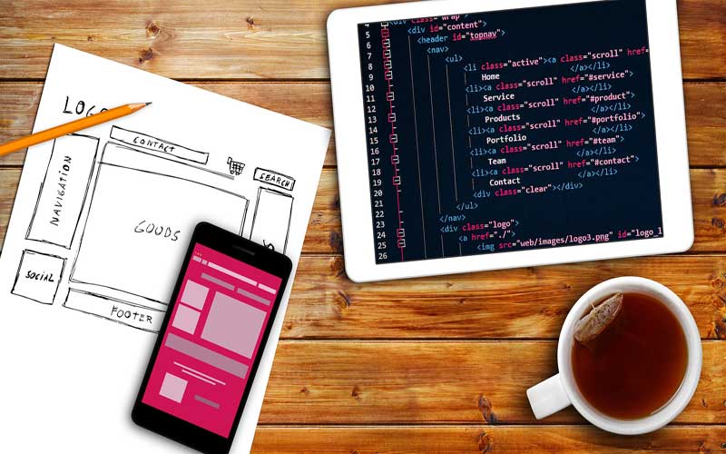
If your psychology business has a website, have you ever taken time to consider how well it is performing or if it is helping your business as much as it should? The reason these questions are important is that according to Perth web designers, your Google ranking is highly influenced by how visitors interact with your website.
In addition, conversions on your website, which can include prospects leaving their details, them making a call to book an appointment, or them purchasing a product you sell, such as books and courses, will all be impacted by the design of your website.
One of the key measures which will affect all of the above, either positively or negatively, will be the length of time a visitor spends on your website. If they remain for a reasonable length of time, then that is good news, but, if they leave almost immediately, it is bad news and suggests that something is not right with your website design.
The first concern, if visitors are leaving quickly, is your ranking on search engines, especially Google. One of Google’s key goals is to ensure that the search results they generate provide those searching with websites they are happy with. The term ‘user experience’ is often used by Google to identify this.
Continue reading “Why Effective Website Design Means Visitors Stay Longer On Your Psychology Business Website”


